eHarmony has Updated their Branding and Visual Identiy
Contributed by: Editor on Thursday, December 07 2023 @ 09:52 am
Last modified on Thursday, December 07 2023 @ 10:56 am
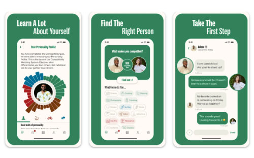
eHarmony has revealed the next chapter in their journey with the introduction of an updated visual identity. The update features a contemporary wordmark, a modern color palette, and a minimalist icon – all designed to elevate the user experience and attract more singles on the dating service.
eHarmony states that "these changes not only underscore our dedication to innovation but also strengthen our commitment to fostering meaningful and enduring connections."
Many of the larger dating apps recently like Tinder, have also revamped the design of their dating apps. These companies feel with the worst of the pandemic behind us now, dating singles are looking for a change. A redesign helps with this transition and keeps many daters on the service they started on, instead of moving to another.
Redesigns also help target new demographics like the under 30 gen z singles. Most designs for this audience tend towards being modern and minimalistic, and using fewer colors.
eHarmony also added a video showing off the new experience you will have on their dating app.
For more on this dating service, please check out our review of eharmony.

